Overview
In the last blog post, Recreating a MS workbook in PowerBI: Part 1 – Get the data – Yet Another Security Blog (garybushey.com), we looked at how to get data from Microsoft Sentinel into PowerBI.
In this blog post, we are going to create the basic report that mimics the Microsoft Sentinel Security Operations Efficiency workbook.
Introduction to PowerBI reports
There are lots of information on how to use PowerBI and create reports, so this is going to be a very brief introduction to PowerBI and creating a report.
First, a report in PowerBI is a collection of pages. This can be compared to a workbook in Microsoft Sentinel that has a collection of tabs. The workbook we are looking at does not have different tabs so we could put all the information on one page in PowerBI.
However, this is also the time to think about if how the information being shown in the workbook is the best? Can it be separate into different pages to make it easier to see and group data? I am far from a UX expert, so I am not going make any comments one way or another.
The image below shows the main report screen in PowerBI.
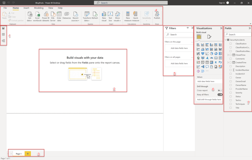
- This is the navigation bar. The top icon is for Reports (where we are now), the middle icon is Data that allows you to see the data inside the tables, and the bottom icon is Model where you can see the table’s relationships as well as modify the data within the tables.
- The is the main area where you will create your report.
- This is where you can add new pages to your report or switch between them
- The header bar has lots of tools and will change depending on which navigation area you are in and what you are doing
- Filters allow you to filter data to only see what you want. This can affect all the data on the page
- Visualizations are all the various ways you can show your data
- Fields show all the tables that you can use. You can expand the table (as shown in the image) to see all the different fields in the table. You can also add new columns and measures here (which we will not be discussing in the blog post).
For this blog post we are going to show the Incidents created over time, Incidents created by severity, Incidents created by owner, incidents created by status, and we are going to show a table of incidents (which is not part of the workbook but will show some nice functionality of PowerBI)
Show all incidents
The first visual we are going to add is a table to show all the incidents. To do this, go the visualizations section and look for the table. You can mouse-over each icon to see what it is called. In the image above, it is in the 5th row from the top, 3rd icon from the left and looks like a table.
Click on it and you see a representation of the visual showing on the screen and there are fields you can fill in showing up under the listing of icons in the Visualization section.
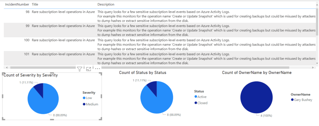
From the listing of fields for the “SecurityIncidents” table in the Fields section, drag “Title” and “Description” columns onto the “Values” field in the Visualizations section. Also, drag the right side of the table visualization all the way to the right to take up the entire main area. When you are done it should look like the image below. Of course, the actual data shown will be different.
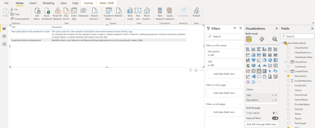
Now, you will not be able to tell from my data, but I have more incidents than what is being shown. I actually have 9 Incidents. Why are only 2 showing up? This is because PowerBI is grouping the incidents together behind the scenes. I have two groups, one for those incidents with the title “Suspicious Resource deployment” and the second has “Rare subscription-level operations in Azure”. How can we fix this? We need to determine what we can add to the table to make it unique.
What can we add? The obvious answer would be “IncidentNumber” since we took care to make sure we only have one row per incident in our table. Go ahead and drag “IncidentNumber” column from the Fields section into the “Values” field in the Visualizations section. If you drag it to the top of list, it will show up first as shown below:
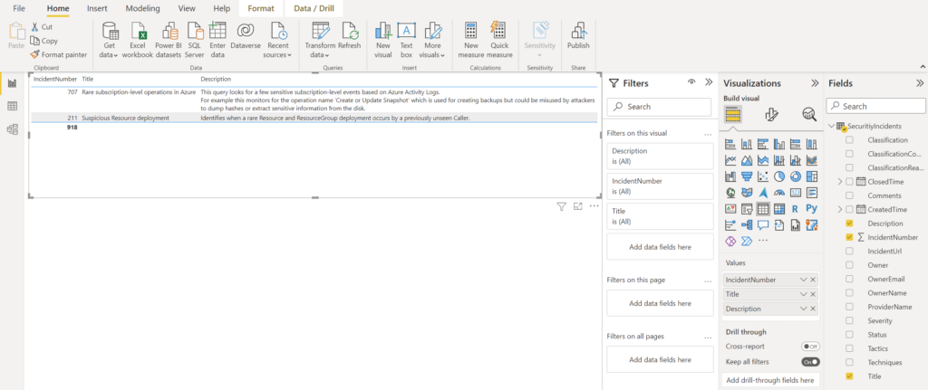
Now what is going on? Didn’t I just say this was a unique identifier? I promise I am not lying to you. The issue is that because the “IncidentNumber” field is a number, PowerBI will perform numeric operations on it by default. If you look at its entry in the Fields section, you will see that the Greek symbol for summation is shown. This means that PowerBI is adding all the “IncidentNumber” entries together for each of the groups we described earlier.
There are two ways to solve this in our case. The first way is to change the data type of the field (which we will discuss in a future blog post) and the second way to is get rid of the summation. This is quite easy.
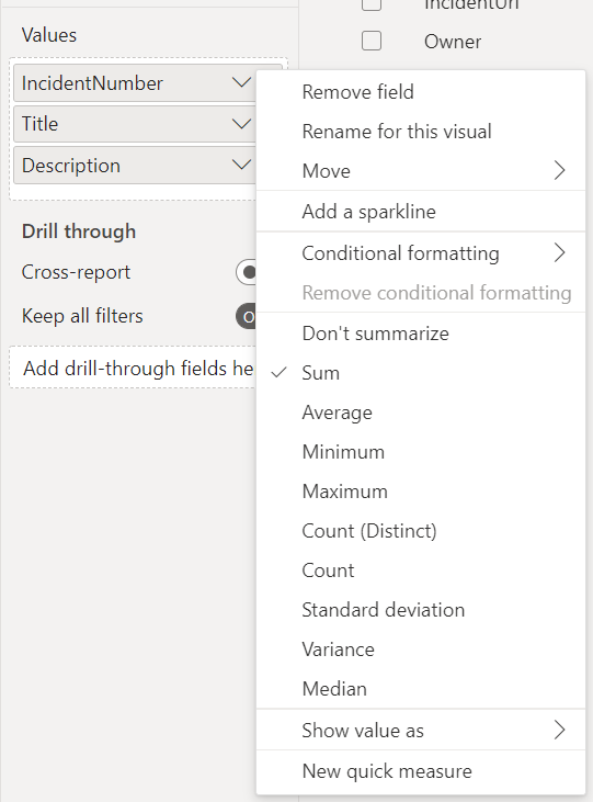
In the “Values” field Visualizations section, click on the drop down for “IncidentNumber”. You will see that “Sum” is selected, as shown below. Select the “Don’ summarize” entry instead.
With that selected, you should see all your incidents (if you have not already) and there will be a scroll bar on the right-side if needed.
Incidents created by X
In this section we will create the different pie charts to represent the incidents created by status, owner, and severity. The steps for all will be the same so once you create one the rest should be easy.
First, make sure you click in the main area outside of the table, if you have the table selected and you click on another icon in the Visualizations section, you will change the table visualizations into the new visualization.
Click on the Pie Chart icon (or the Donut chart if you prefer). In both the “Legend” and the “Values” entries in the Visualizations section, drag the “Severity” column into them. This will create a new pie chart that shows all the incidents grouped by severity and using the severity values in the legend. You will also want to resize the visualization to take up a third of the page to make room for the other pie charts.
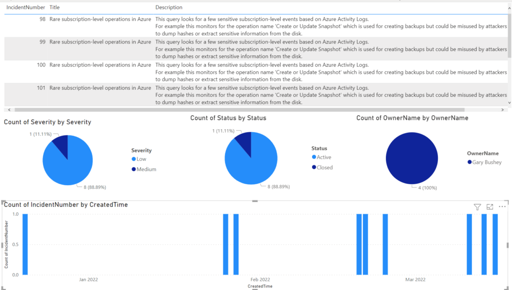
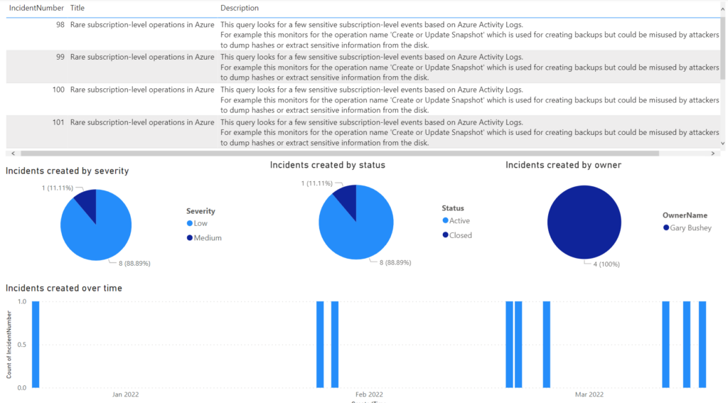
Create two new pie charts using the “Status” and the “OwnerName” columns. You may need to drag the visualizations around and resize them to have them all fit. When you are done, it should look something like what is shown below.
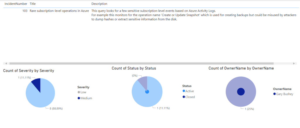
Now we come to the point where PowerBI really shines. Click on one entry in the pie chart grouped by “Severity”. If you have one entry that has a low number of items, choose that. In my case, I am going to choose the “Medium” severity. Notice that all the other visualizations are also filtered to show only the items that represent that selected entry.
If you look at the image below, you will notice that there is only one incident showing up and both the pie charts grouped by Status and Owner have been filtered as well to show that one incident is active and that incident does not have an owner. You can also select a value from the other pie charts to filter further. For instance, I could see just those Low severity, Active incidents owned by Gary Bushey by clicking the different entries in the pie charts.
Granted, you can do this in an Azure workbook, but it is much, much harder.
Incidents created over time
Lastly, we will add a bar chart that shows incidents created over time. For this one we will use the “Clustered column chart”. Go ahead and add that to the main report.
For the “Axis” field we want to use “CreatedTime”. This leads us to another issue we will run into with PowerBI. Since the “CreatedTime” column’s data type is Date/Time (designated by the calendar icon to the left of the column name), is gets broken down into its component Year, Quarter, Month, and Day. While this can be very useful at times, it is not what we want here.
Click on the drop-down icon for “CreatedTime” in the “Axis” field and then select “CreatedTime” rather than “Date Hierarchy” in the drop-down list. This tells PowerBI to just use the value in the column rather than breaking it down.
Next, we want to use the “IncidentNumber” column in the “Values” field. In this case, it is using the actual value of the incident number, which is not what we want. Click on its drop-down link and select “Count” in the drop-down list so that we just see the total number of entries.
When this is all done it will look similar to what is below. Unfortunately, all my incidents were created on different dates, so it is hard to see the differences. And, of course, the values being shown will be filtered by selecting values in the other visualizations and vice-versa.
A note on titles
One thing you may have noticed is that the default titles PowerBI creates are not that great. They do explain exactly what is going on, but I doubt they are what you want.
Luckily, this is easy to change. Select any of the visualizations you have added and then in the Visualizations section, select the “Format your visualization” icon (which looks like a paint brush in front of a bar chart). Note that I am using the latest and greatest verson of PowerBI desktop which has had the UI changed a bit so you may need to look around if you are using an older version.
In the new tab that is shown, you will need to click on the “General” tab. There, you will see the “Title” entry that you can expand. Here you can change not only the text, but also other values like the font, font size, color, and so on.
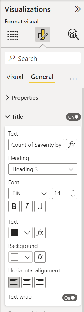
Go ahead and make the title something useful. For the visualization I have selected, I would change it to “Incidents created by severity” to make the workbook.
When it is all said and done, my report looks like the image below
Summary
This blog post shows the basics of creating a report based on the data we ingested from the last post. There are many more visualizations that can be added to match the workbook. Go ahead and play around and learn some of the power of PowerBI.